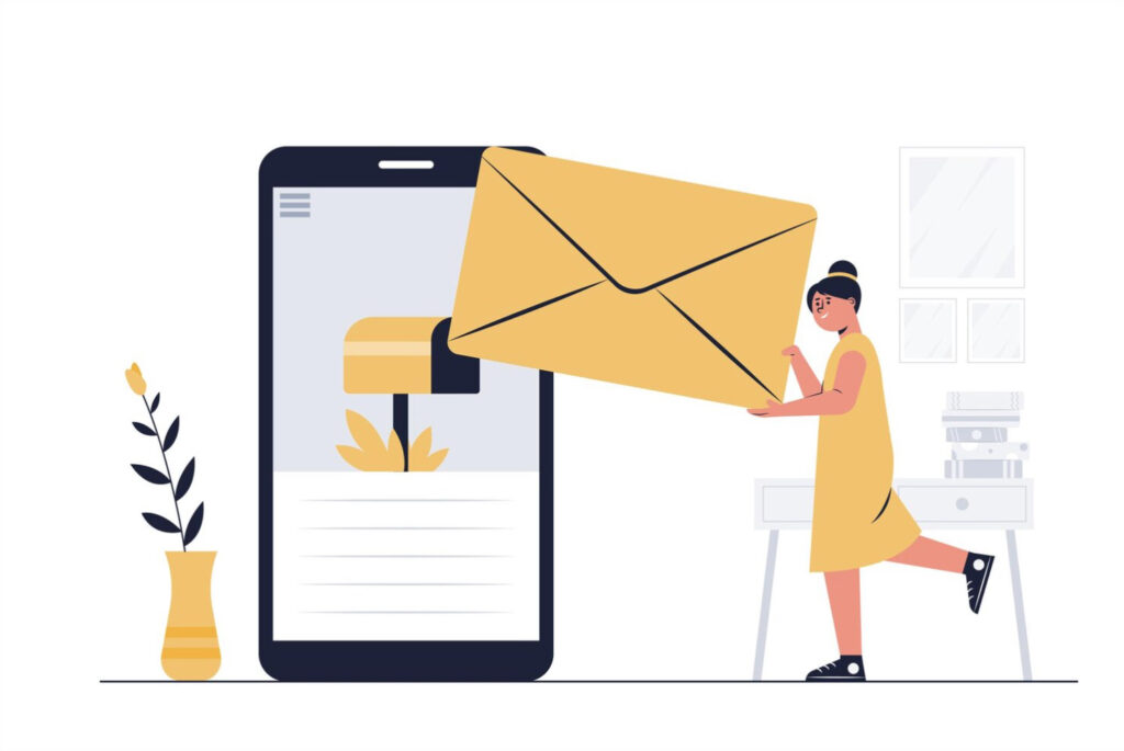
With the ever-increasing use of mobile devices, optimizing email design for mobile users has become a necessity. In this blog post, we will explore the importance of mobile optimization and provide valuable tips and best practices for creating effective email designs that cater to mobile users’ needs.
Importance of Mobile Optimization
Mobile devices have become the primary means of accessing emails, making it crucial to optimize email design for these platforms. According to recent statistics, over 60% of email opens occur on mobile devices. Neglecting mobile optimization can lead to poor user experience, decreased engagement, and lost opportunities for businesses. Therefore, prioritizing mobile-friendly email design is essential to ensure that your messages effectively reach and engage your audience.
Key Tips for Effective Email Design for Mobile Users
Simplify the Layout
When designing emails for mobile users, simplicity is key. Opt for a clean and uncluttered layout that allows for easy scanning and reading. Use clear and concise content, and consider adopting a single-column structure that fits well within the limited screen space. Additionally, leverage ample white space to enhance readability and create a visually pleasing experience.
Use Mobile-Friendly Fonts and Font Sizes
Choose fonts that are legible on smaller screens. Avoid fancy or complex fonts that may appear distorted or difficult to read. Opt for sans-serif fonts like Arial or Verdana, as they tend to display well on mobile devices. Furthermore, ensure that your font sizes are large enough to be easily readable without zooming in, typically aiming for a minimum font size of 14 pixels.
Create Clear and Compelling Call-to-Actions
Effective call-to-actions (CTAs) are vital for driving desired actions from your email recipients. Design prominent and visually appealing buttons or links for your CTAs. Use contrasting colors to make them stand out and ensure they are easily tappable. Craft compelling and action-oriented copy to motivate users to take the desired action, whether it’s making a purchase, signing up, or downloading.
Optimize Images for Mobile Viewing
Images can greatly enhance the visual appeal of your emails. However, it’s crucial to optimize them for mobile viewing. Use mobile-friendly image formats like JPEG or PNG and compress the file sizes to avoid slow loading times. Ensure that your images are responsive and adjust proportionally to different screen sizes. This way, they won’t appear too small or too large on various devices.
Use Responsive Design Techniques
Responsive design is an essential aspect of mobile-friendly email design. Implement responsive design techniques to ensure that your emails adapt and display correctly across different mobile devices and screen sizes. This includes using media queries, flexible layouts, and scalable images. By embracing responsive design, you can deliver a consistent and optimized experience to all recipients, regardless of the device they use.
Keep the Email Length Concise
Mobile users often have limited time and attention spans. Therefore, it’s crucial to keep your email content concise and to the point. Craft succinct and impactful messages that convey the necessary information without overwhelming the reader. Use clear headings, short paragraphs, and bullet points to facilitate quick scanning. If additional details are required, provide links to dedicated landing pages or websites.
Best Practices for Mobile-Friendly Emails
Conduct Testing and Optimization
Testing your emails on various mobile devices and email clients is crucial to ensure optimal display and functionality. Test your emails across popular devices, such as iPhones and Android smartphones, using different email clients like Gmail, Outlook, and Apple Mail. Pay attention to the rendering, formatting, and responsiveness of your emails. Continuously optimize and refine your design based on the test results to deliver the best possible experience.
Personalize and Segment Email Campaigns
Personalization and segmentation play a significant role in improving engagement and conversions. Tailor your emails to meet the specific preferences and needs of your audience segments. Use data-driven insights to deliver relevant content, offers, and recommendations. By personalizing and segmenting your email campaigns, you can enhance the user experience and increase the chances of conversion.
Ensure Easy Clickability on Mobile Devices
Make it easy for mobile users to interact with your emails by optimizing clickability. Use larger buttons that are easy to tap with a finger, ensuring they have sufficient spacing between them to avoid accidental clicks. Avoid placing clickable elements too close to other elements, reducing the chances of misclicks. By optimizing clickability, you improve the user experience and encourage desired actions.
Use Preview Text Effectively
Preview text, also known as preheader or snippet text, is the preview snippet that appears alongside the subject line in an email client. Craft compelling preview text that entices recipients to open the email and discover more. Use concise and attention-grabbing language that highlights the value or intrigue of the content within the email. Utilizing preview text effectively can significantly improve your email open rates.
Pay Attention to Loading Speed
Loading speed plays a crucial role in user experience and engagement. Optimize your email design to ensure quick loading times. Compress images and optimize code to minimize file sizes and reduce loading times. Additionally, avoid excessive use of animations or heavy media that may slow down the loading process. By prioritizing loading speed, you create a seamless and enjoyable experience for mobile users.
Optimize for Different Mobile Platforms
Consider the diversity of mobile platforms and email clients when designing your emails. Test your emails across various platforms, such as iOS and Android, and ensure compatibility with different email clients like Gmail, Outlook, and Yahoo Mail. Pay attention to how your emails render, ensuring consistency and optimal display across platforms. Adapting your design to different mobile platforms ensures a cohesive experience for all recipients.
Conclusion
In the mobile-dominated era, designing effective emails for mobile users is essential for successful email marketing campaigns. By implementing the tips and best practices discussed in this blog post, you can create engaging, user-friendly, and conversion-oriented emails that resonate with your mobile audience. Prioritize mobile optimization, test and optimize your designs, and continuously refine your email strategies to ensure maximum impact and engagement on mobile devices.